Flash Logo Redesign
Flash is a social media app targeted at teens and young adults between the ages of 16–25. After I and the design team redesigned the entire app experience, I took upon the task of redesigning the logo and brand guidelines to be more inline with the new nature of the Flash app.
Objectives
Design a new logo for Flash that reflects one or more of the purpose, values, and goals of the Flash app:
friendship
excitement
spontaneous
connection
lightning theme (energetic)
Most importantly, the new logo should be “friendly”
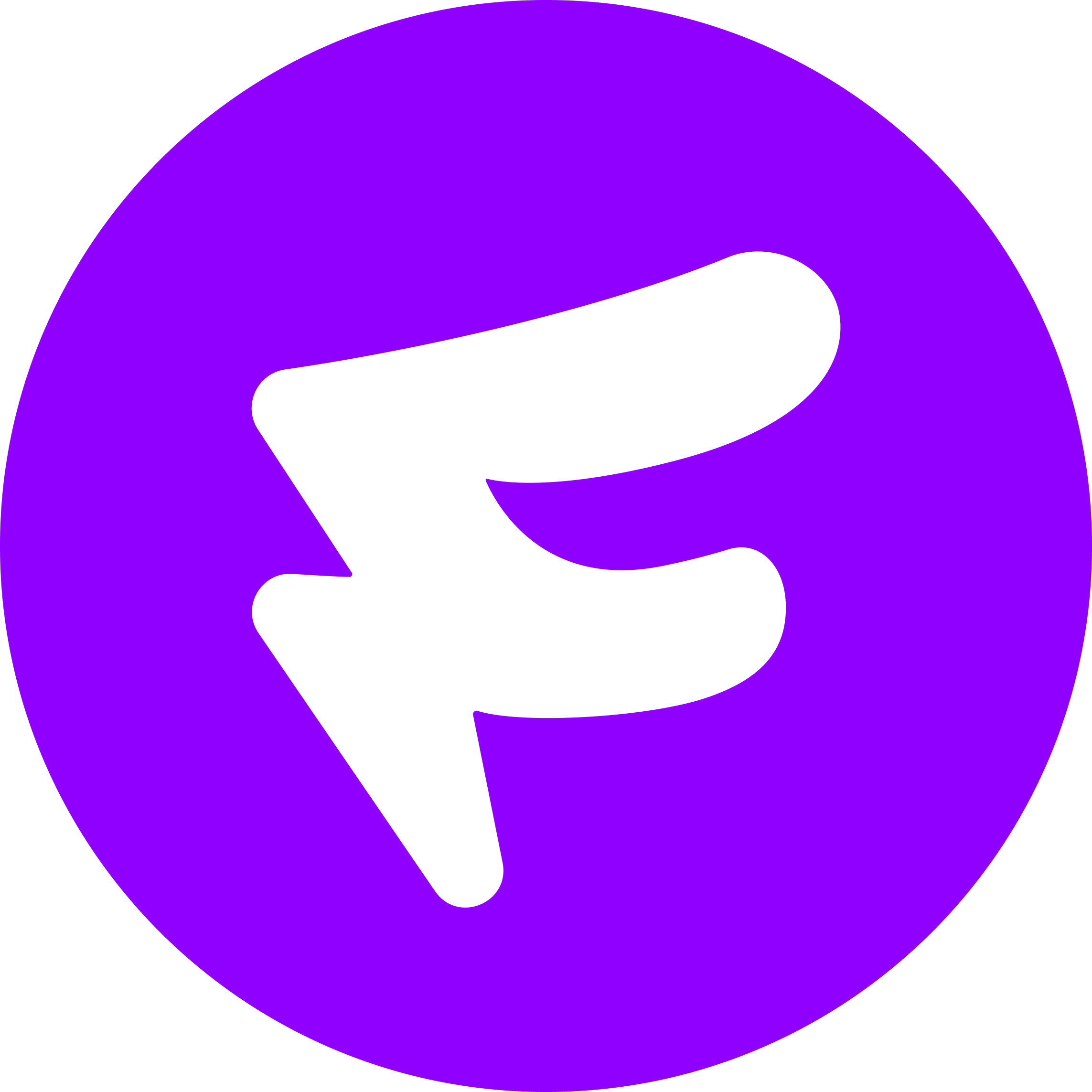
Original Logo
While the original logo is unique and memorable, the founder and company leadership believed it to be a bit “cold” and too hard edged. They wanted something that would be more friendly, like the new app design.
Ideation
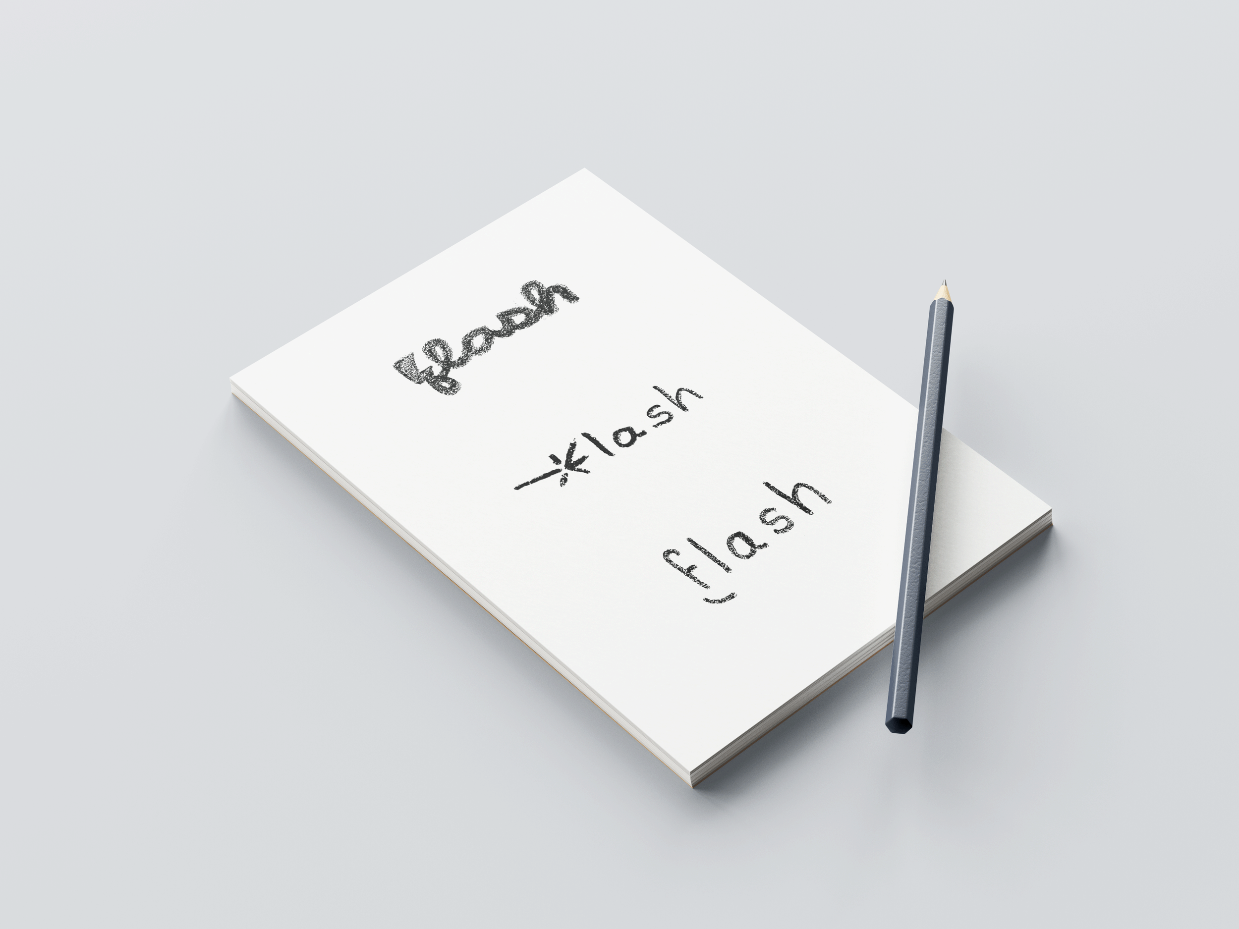
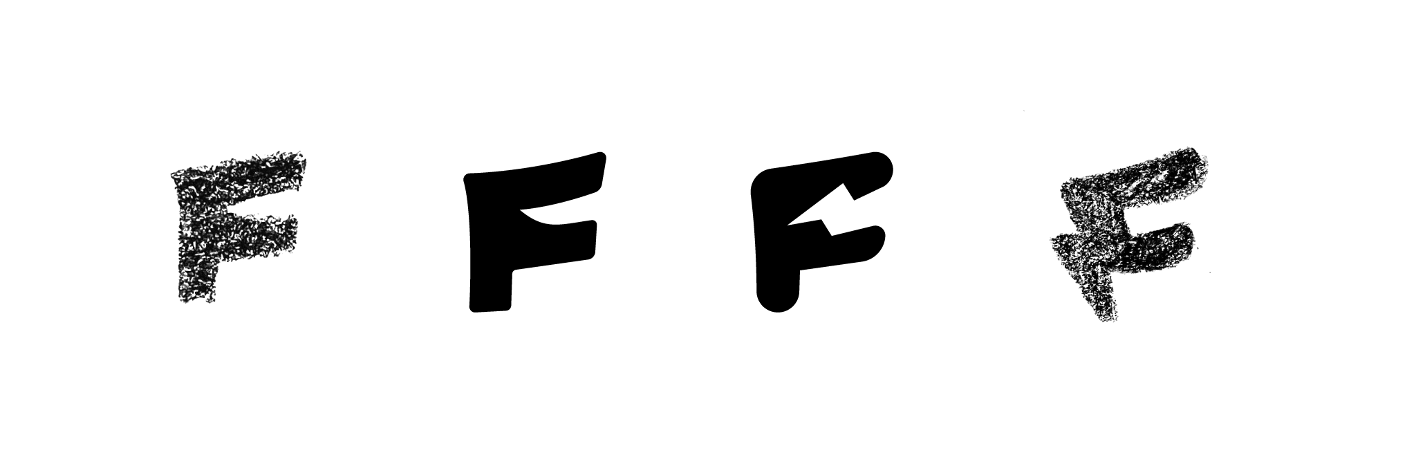
After several explorations, I began focusing on ways to bring together three elements: lightning, the letter-form F, and a smile.
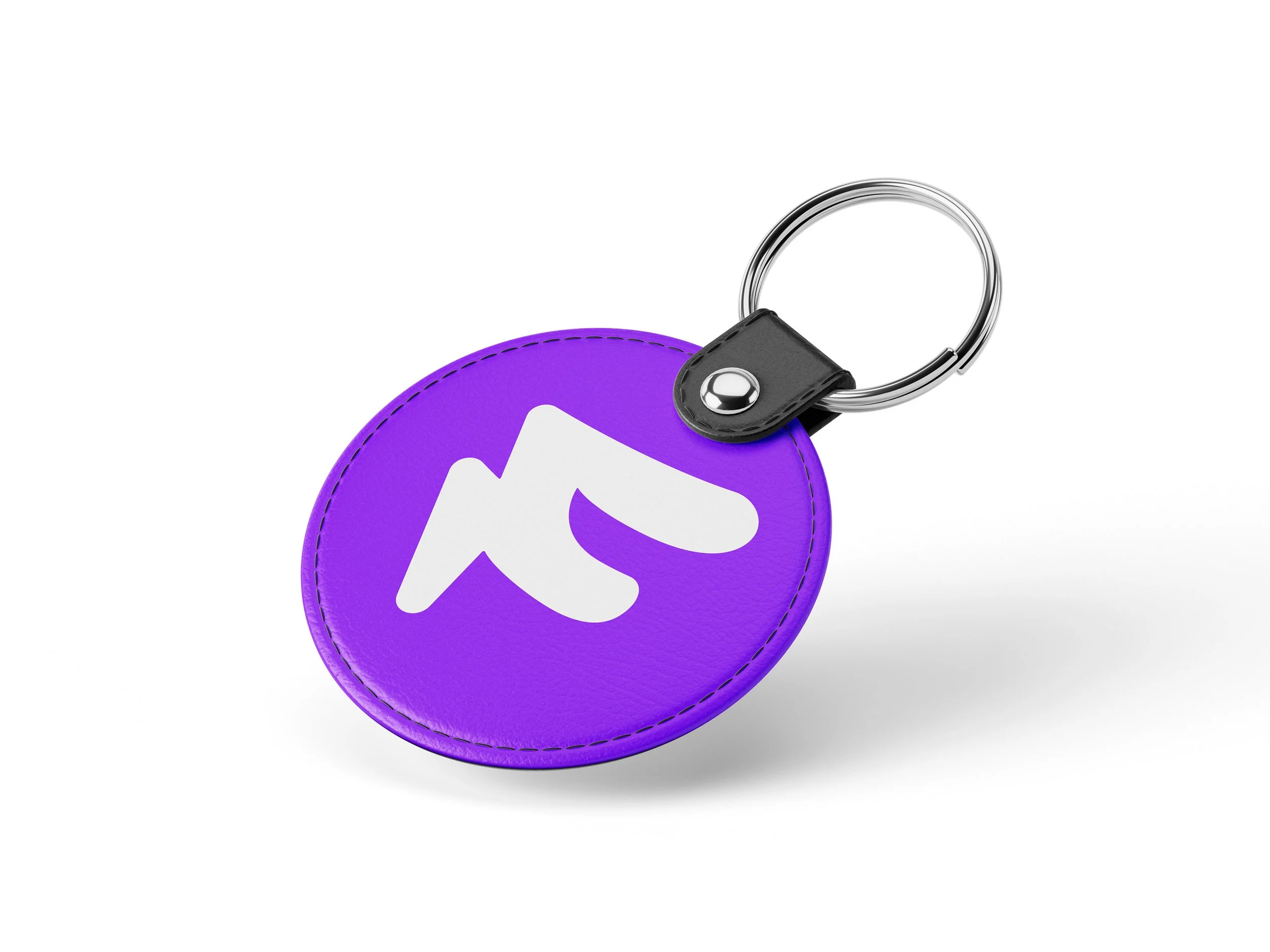
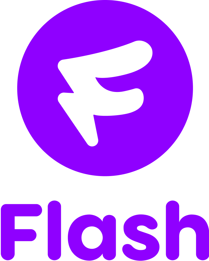
Final Logo
The final logo design is a culmination of multiple qualities and philosophies that guided our redesign of the Flash app:
Friendship & joy (hence the smile formed by the top half of the F)
Personalization, as our app allows users to mark up their virtual instant-film photos (hence the organic, hand-drawn quality of the logo’s letter-form)
Lightning, to keep in line with the name of the app, and to maintain the original logo’s originality (the left side of the logo forms a lightning bolt)
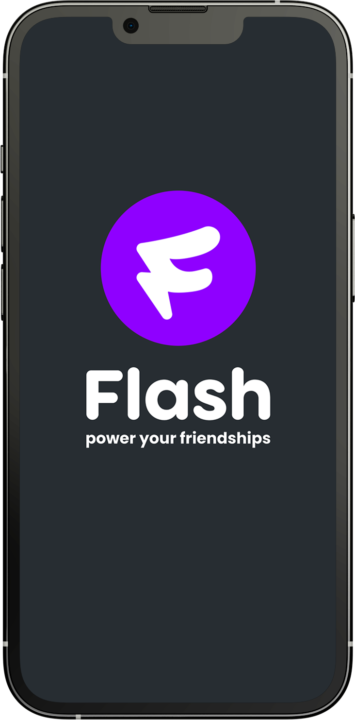
Logo + Name and Caption

Brand Guidelines

Colors