
Flash App Redesign

Context
While the first version of the Flash app was functional, the design team and I believed it was too cold and rigid, lacking the inviting and friendly tones the team wanted to convey.

Two screens from Version 1 of our app
Problem Statement
After discussions with the entire team and company founder, we decided to design a warmer, more approachable user experience. The current interface was not as visually appealing as, or distinct from, its competitors; it was also unnecessarily complex and needed simplification. We needed to make users feel more welcomed and entice them to share their moments with friends, the core feature of our app. Moreover, we needed a way to stand out from other photo sharing platforms.
User Personas
The first step of the redesign process was to gain a better understanding of our user base and target demographic. Based on insights from user testing and interviews conducted by our UX researcher, we distilled our target demographic into two groups, represented by the following personas:


Keeping these personas as our guide, we then defined our project goals.
Design Objectives
Revamp the user experience to be more:
friendly, personable, and engaging
intuitive and easily navigable
unique and memorable, especially amongst a sea of competitors
Friendly, personable, and engaging
Working in Figma, our first step was to change the typeface used across our app, replacing Lato with Poppins, a more friendly yet modern (sans serif) typeface.

As lead designer I was also responsible for redesigning the visual brand identity of Flash, including a new logo, to be in line with our app redesign.
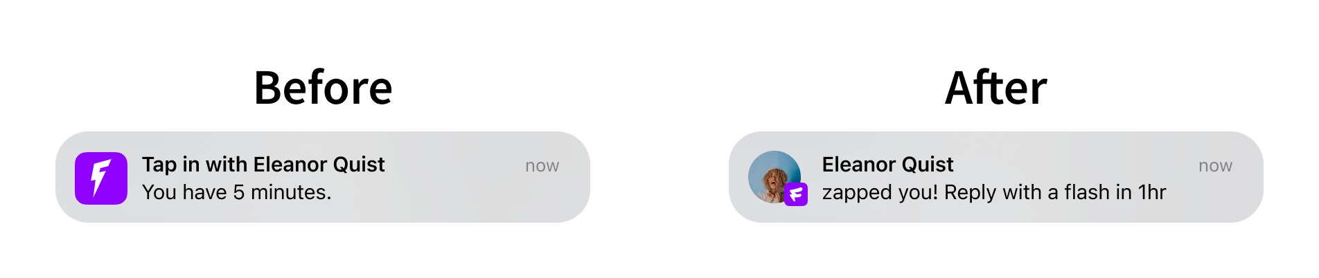
In collaboration with our marketing team and copywriter, we then updated the language used in our interface, to make the tone of our app more fun and engaging. For example, the language for our app’s primary interaction mode was changed from “Tap in” to “Zap”.
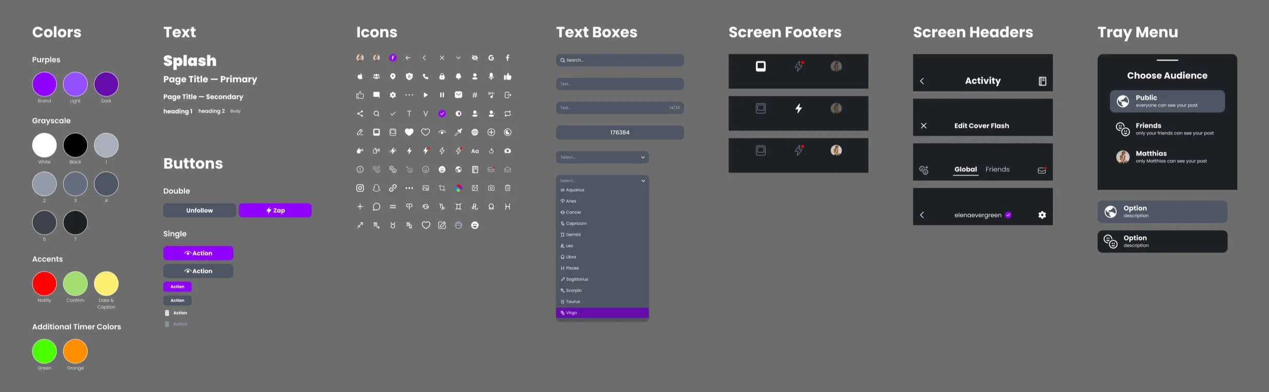
In addition, we created a new style guide to ensure consistency in the colors, fonts, shapes, icons, and components used across our interface:
Intuitive and Easily Navigable
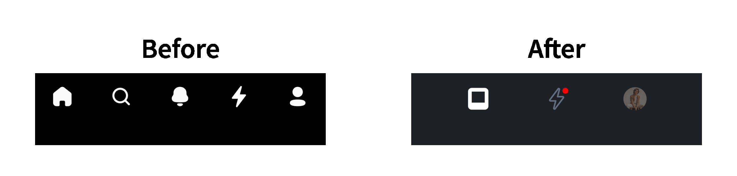
Virtually all screens of the app were redesigned to be simpler and easier to navigate. For example, we simplified the primary navigation bar at the bottom of the screen, to having just 3 main pages instead of 5:

Another example of more navigable layouts is the new Activity (notifications) page, categorized so that users can easily find the activity details they want:
Unique and Memorable
As part of our competitive analysis, we looked at the current social media app landscape: Instagram, Snapchat, BeReal, Lapse, Locket, etc. From this research, we realized that our app had great potential, but was held back by the current design. The core of our app is the idea that users prompt each other to share photos. Our goal was to focus on this more personal interaction and highlight it through a creative approach.
We found that Flash’s spontaneous interactions resemble instant film photography. Our goal was to create a unique experience that blends analog and digital elements through personalized posts that mimic instant film. We maintained familiar social media conventions like comments, notifications, and friend invites while adding our standout feature: the zap page, where users can prompt others to send an instant photo, or "flash."

Collaboration with Developer
Throughout our design process, we worked closely with the developer, documenting our designs in Figma for easy understanding and implementation.
Final Design:

Results
Over the course of our project, we gradually released updates to the app, and grew our user base by 400% as a result. Further user testing, interviews, and screen time analytics can also be studied to inform future design changes and direction.