HYP
visual identity design
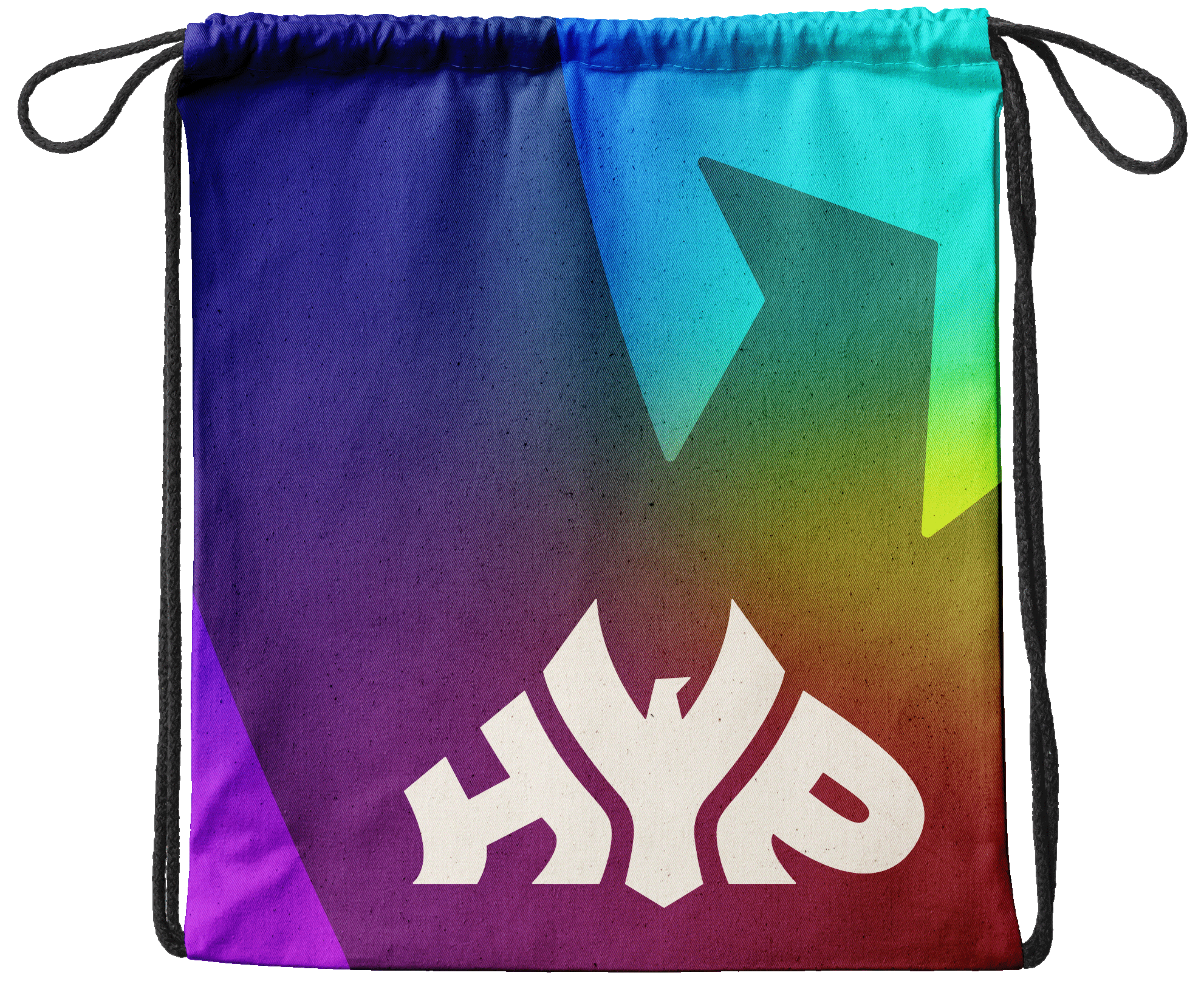
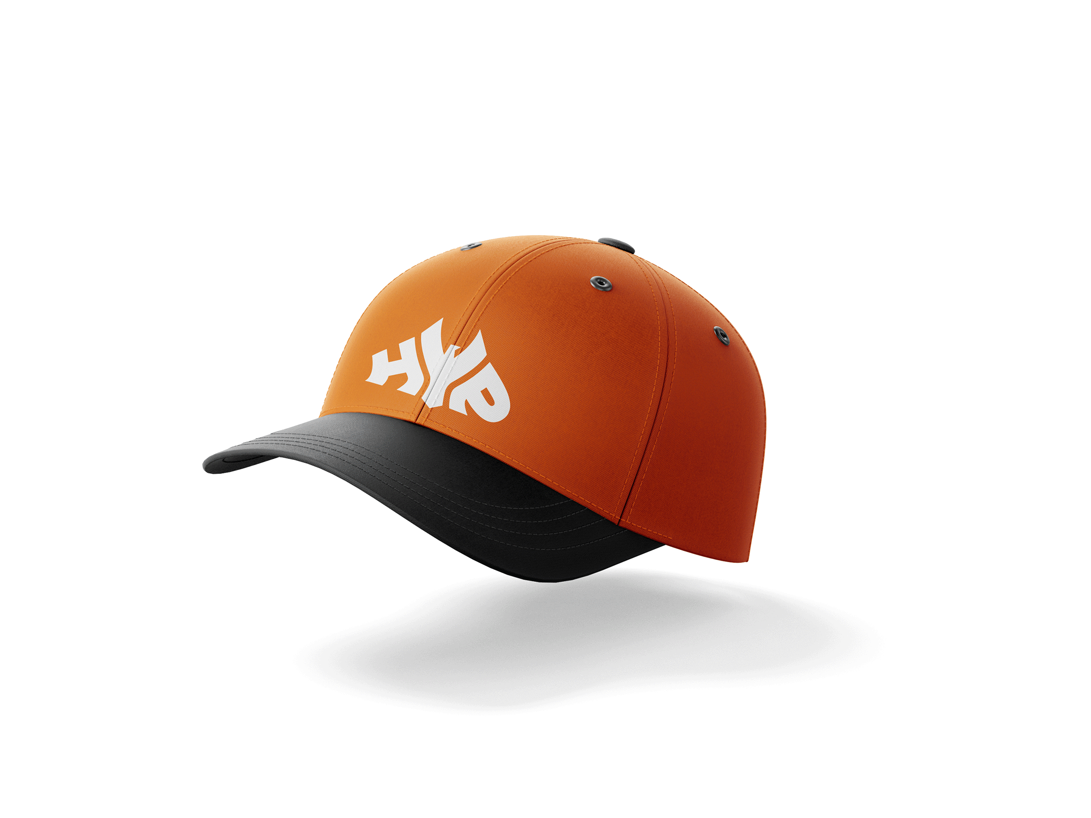
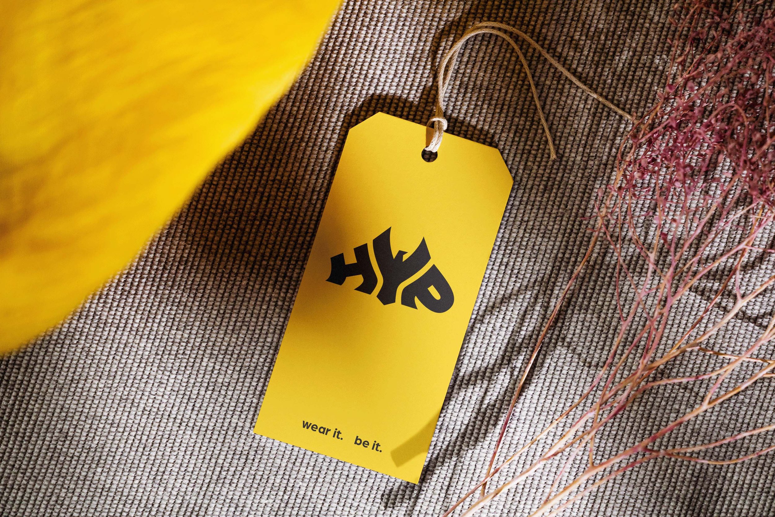
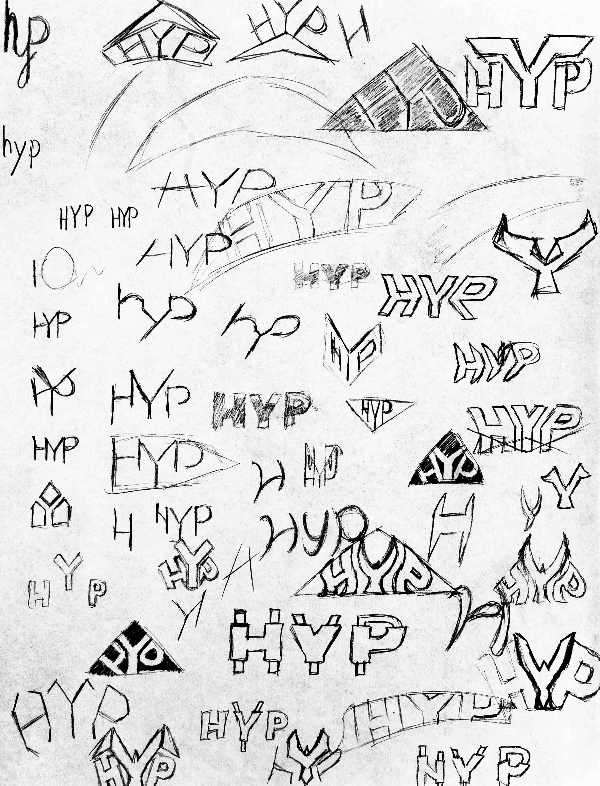
HYP was a clothing and merchandise brand, catered to teens and young adults. A play on the words “hype” and “hip”, the brand was all about bold self expression while being at the forefront of fashion trends.
Objectives
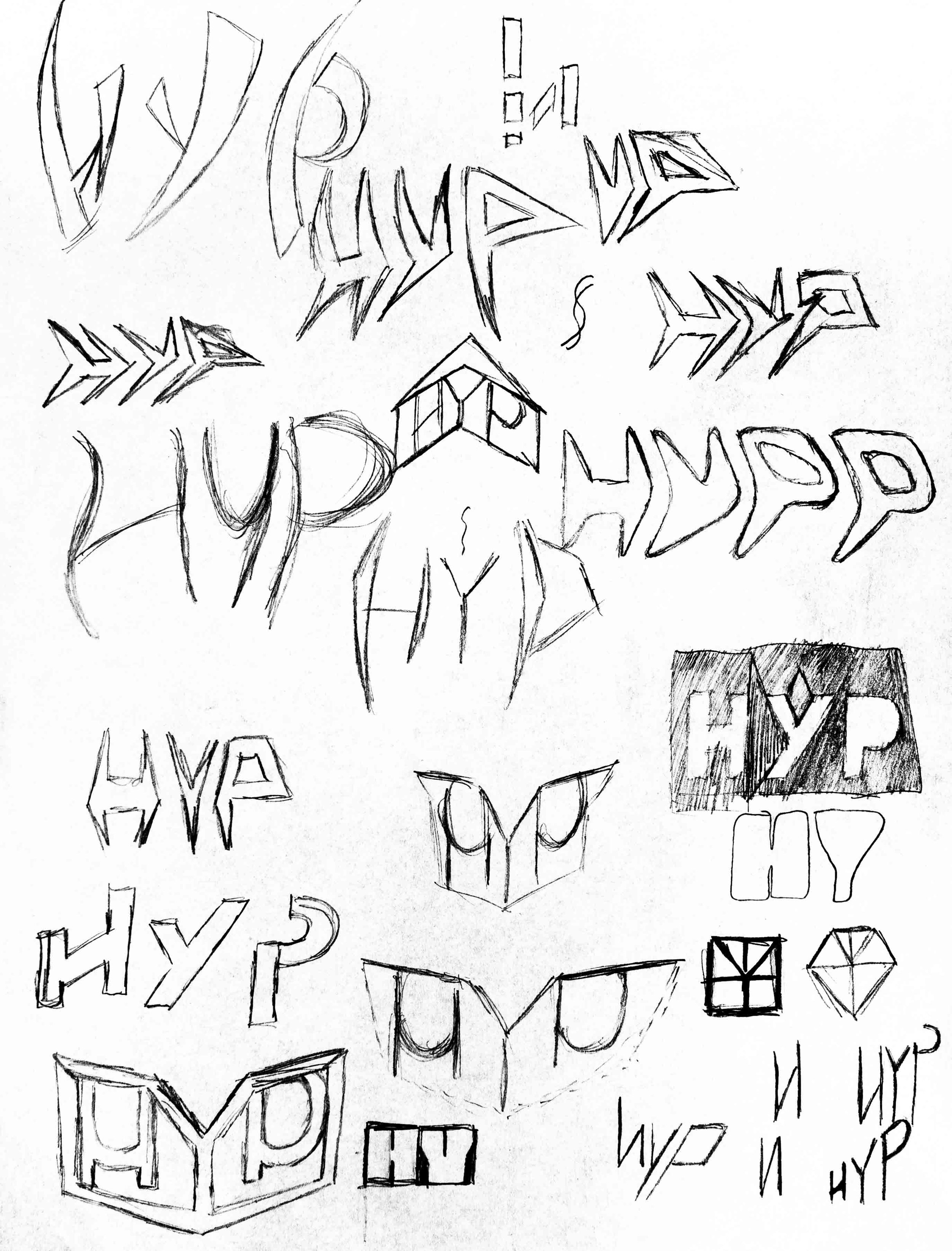
Design the official logo for HYP, one that conveys the forward-looking spirit of the brand
The mark should have modern design aesthetics, but must also be exciting
It should embody the character of the brand: bold yet approachable


Final Design

HYP is all about bold self expression. The letter Y stylized as a bird is a visual metaphor for uplifting ideas in bold and exciting ways.
Together with the upward tilt of the H and P letters, the wordmark creates a subtle arrow-like silhouette, reinforcing the idea of being exciting and forward-looking.