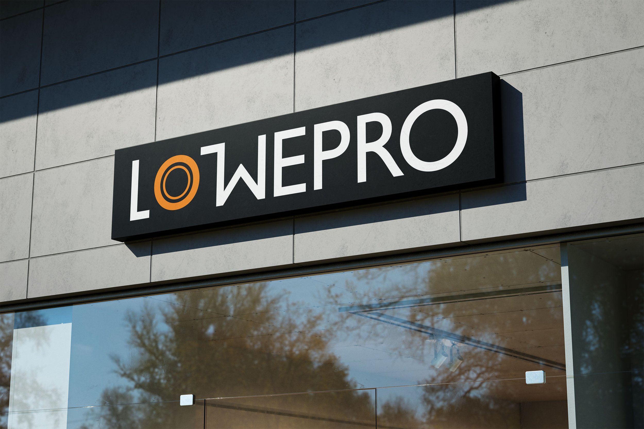
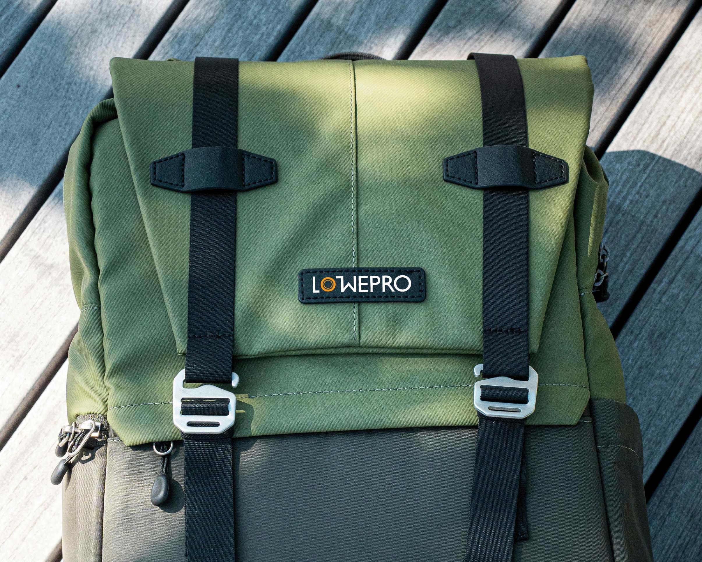
Lowepro Logo Redesign
Lowepro is a company that specializes in bags for camera equipment. This project is a rebranding exercise, where I was tasked with designing a new wordmark and logo for the company, following strict typography requirements, among others.

Asset requirements:
wordmark
logo variation
single and dual-color variations
mock-up concepts
Design requirements:
use only typographic elements from one typeface throughout the project
any new design element or symbol should be designed like a character or glyph from the chosen typeface
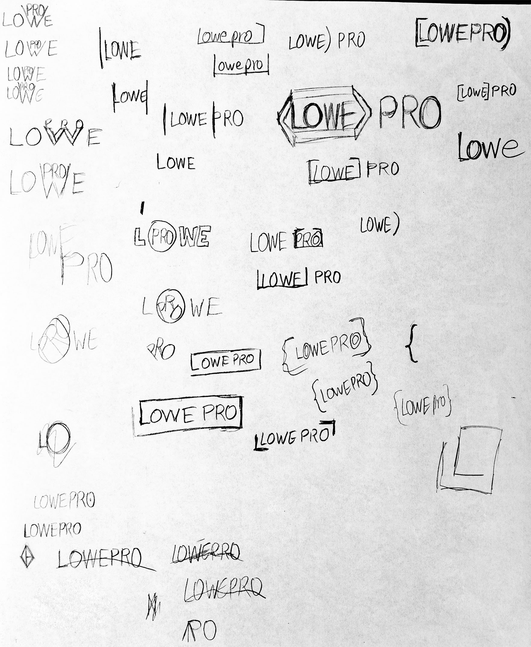

Solution
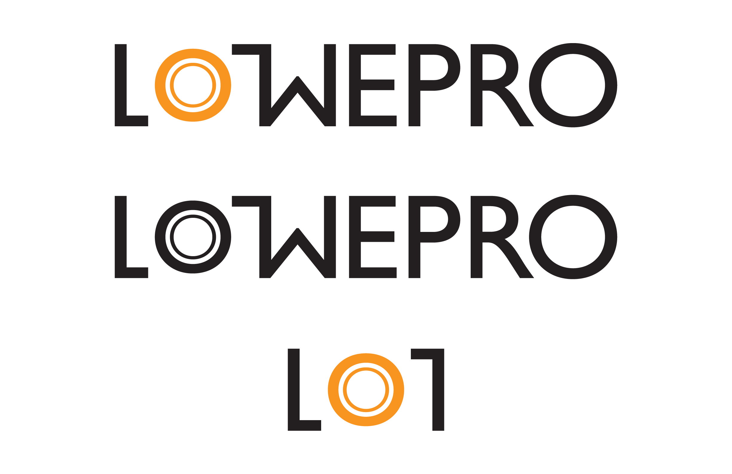
My typeface of choice was Helvetica. The final logo mark, based on the L, O, and W characters of Helvetica medium, is a camera lens between two brackets. The brackets can be seen simultaneously as protective brackets and corners of a camera body.